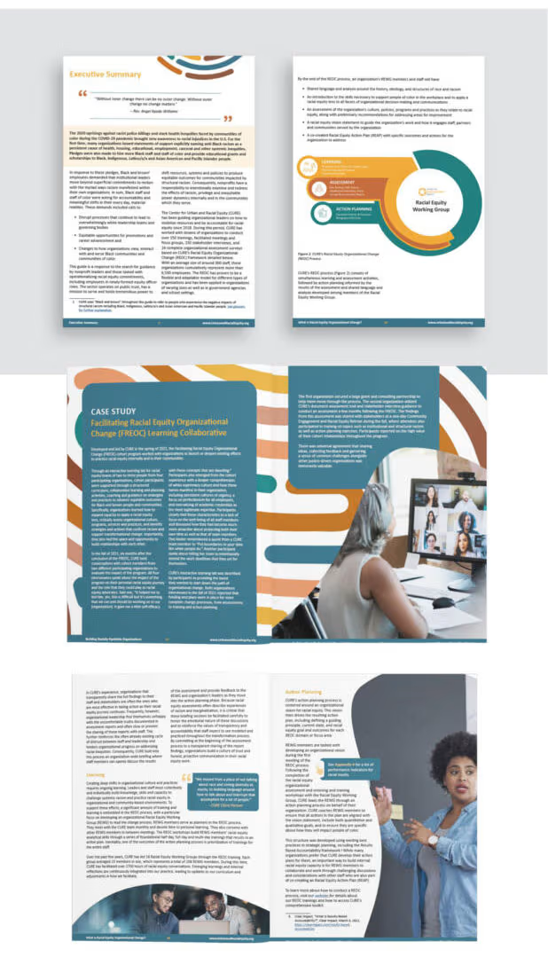
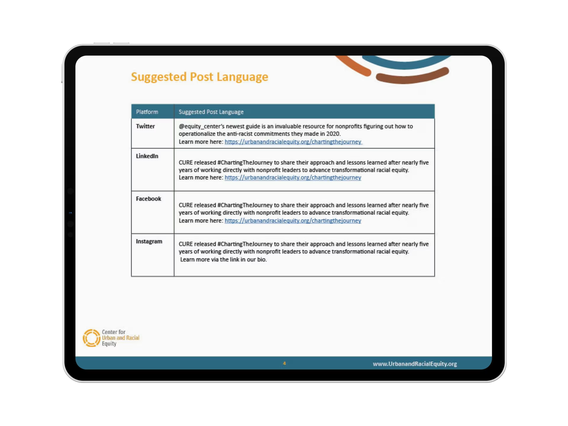
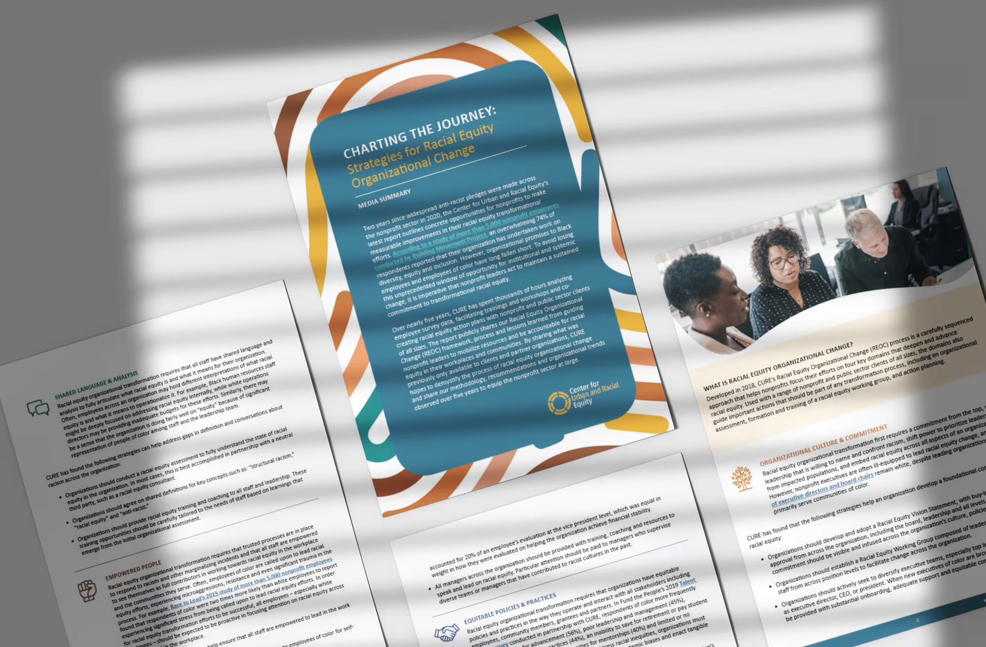
The visual identity balances clarity with an energetic and compelling style. We incorporated color blocks, iconography, and bold photography to create an inviting yet professional design. The angular shapes, inspired by CURE’s branding, reinforce structure and movement, guiding readers through complex information. This intentional use of visuals enhances readability, making key insights stand out. Additionally, we developed supporting brand collateral—including social media graphics and website banners—to maximize the report’s reach and impact.