An up-and-coming mobile application, Qommunity is providing a secure hub for LGBTQ+ individuals.

Client

Qommunity

TYPE OF PROJECT

Brand Identity
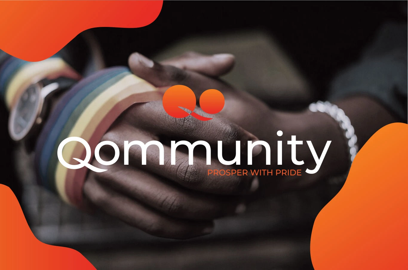
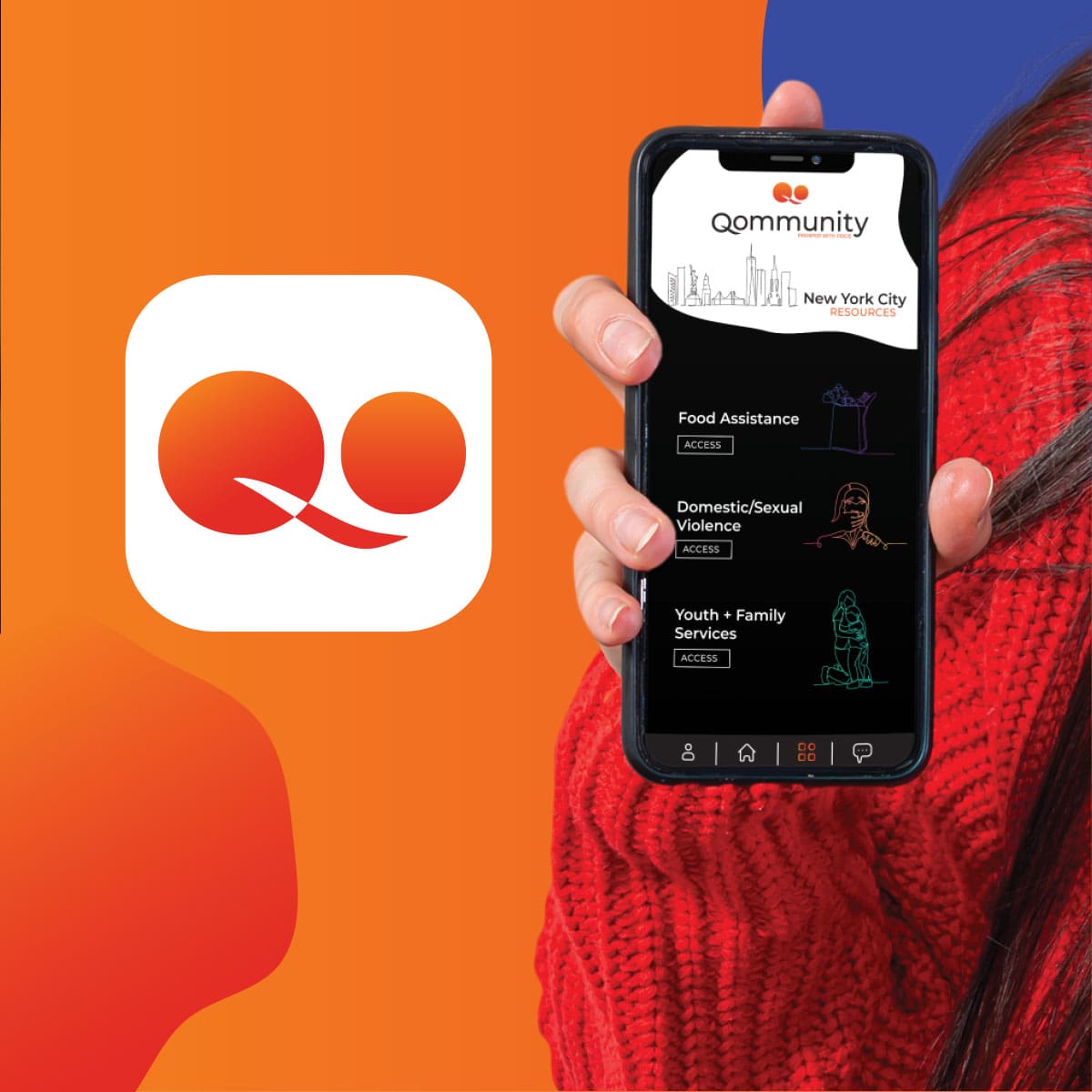
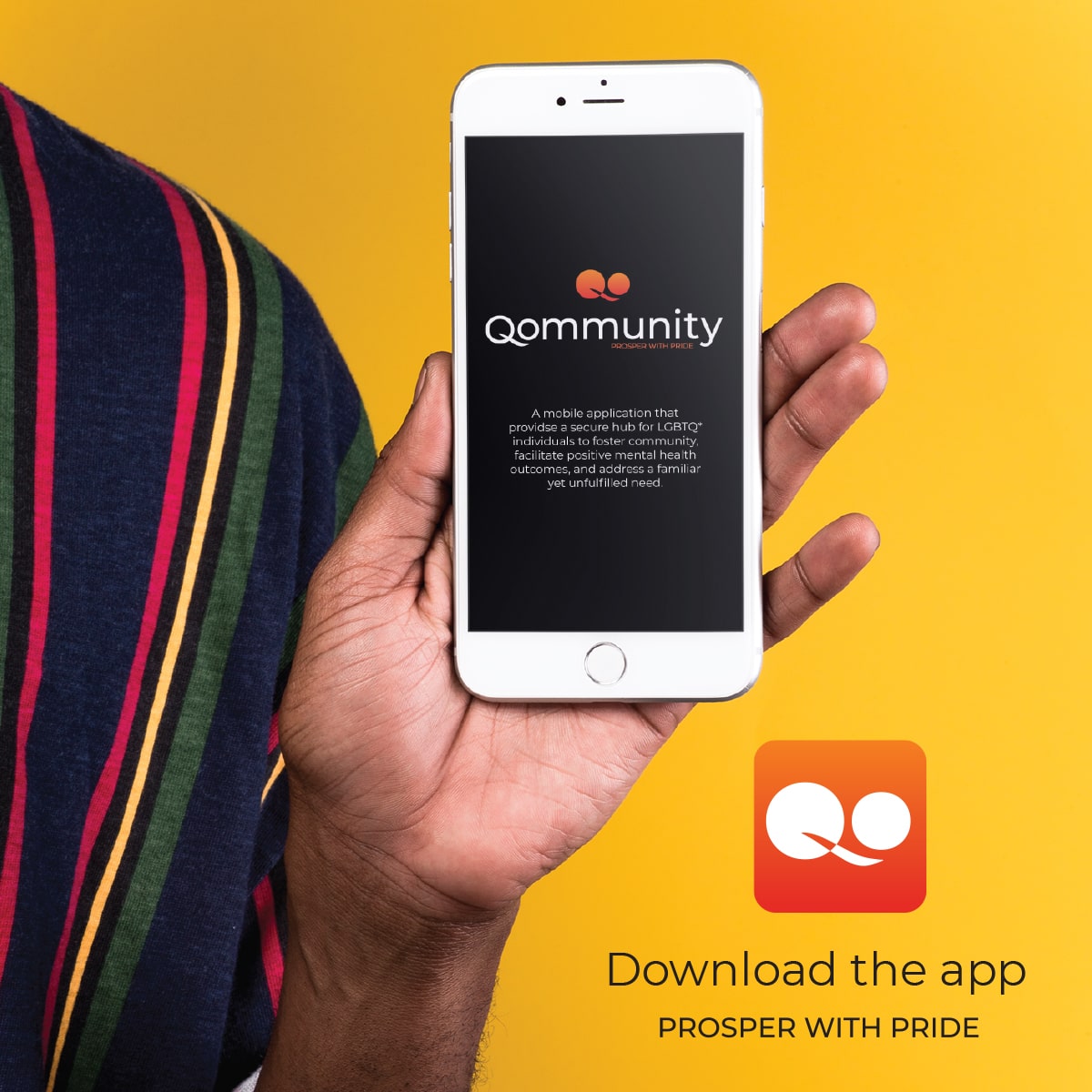
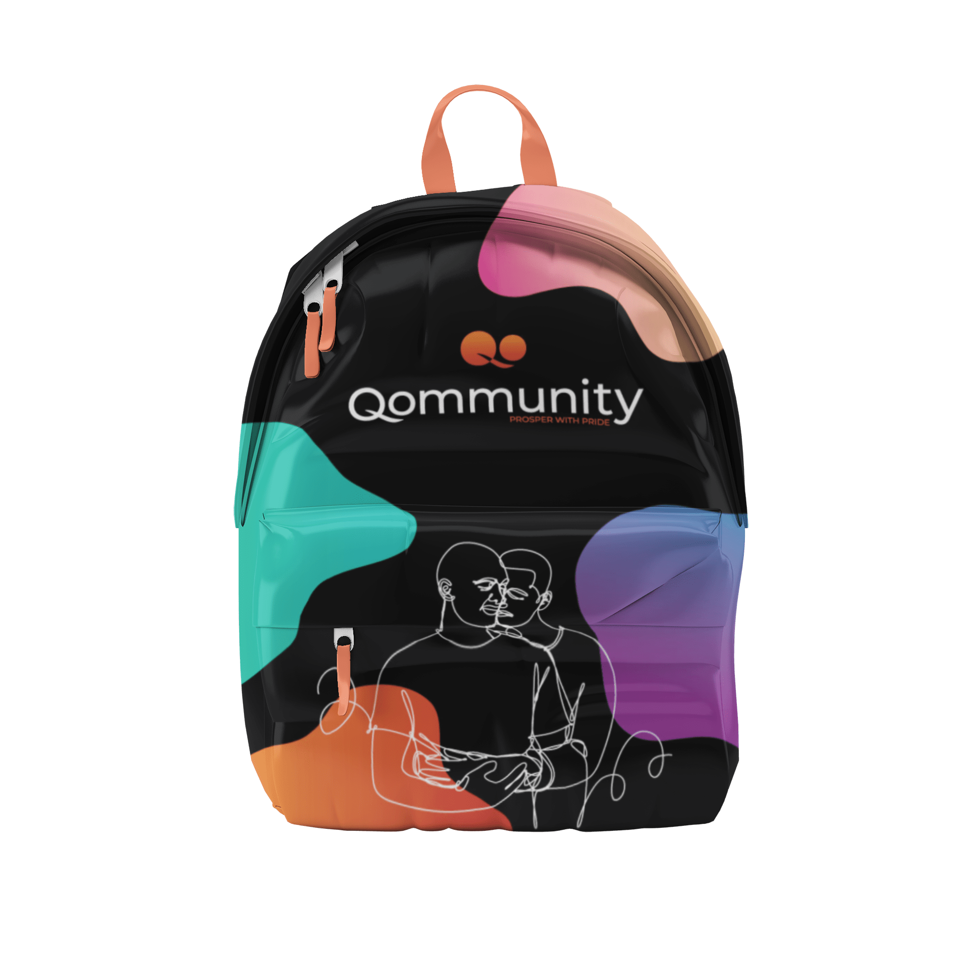
Talooka Studio worked with Qommunity to create a vibrant visual identity reflecting its mission of fostering inclusive economic growth within LGBTQ+ communities. The logo design, featuring two interconnected spheres forming a bold “Q,” symbolizes unity, collaboration, and shared prosperity. Inspired by movement and progress, we used a warm gradient of orange tones to evoke optimism, energy, and pride. The typography balances modern minimalism with an approachable feel, ensuring the brand remains professional yet welcoming.
Qommunity Mockup
Qommunity Mockup
The design aesthetic extends across digital and print media, incorporating clean layouts and dynamic color accents for a cohesive, recognizable brand presence. This identity reinforces Qommunity’s core message of empowerment, growth, and collective pride.
Qommunity Mockup
Qommunity Mockup
Qommunity Mockup
Qommunity Mockup
Qommunity Mockup
Qommunity Mockup
Qommunity Mockup
"Working with Talooka has been awesome! Having no experience with brand design or consulting, the process was smooth and enjoyable. Our venture is just starting and not only was the iterative design process fun and professional, but it also helped us come up with new ideas and reinvigorate old ones. Having such a lovely and thoughtful design for Qommunity will help us meet our social media and website goals, and eventually become a recognizable name. HUGE thank you to Loocie and Tanicia!"
Kaylah Grant, Owner and Founder