Temple Beth Am is a congregation that provides a community for Reform Jews within the Seattle area

Client

Temple Beth Am

TYPE OF PROJECT

Brand Identity | Brand Collateral
Temple Beth Am
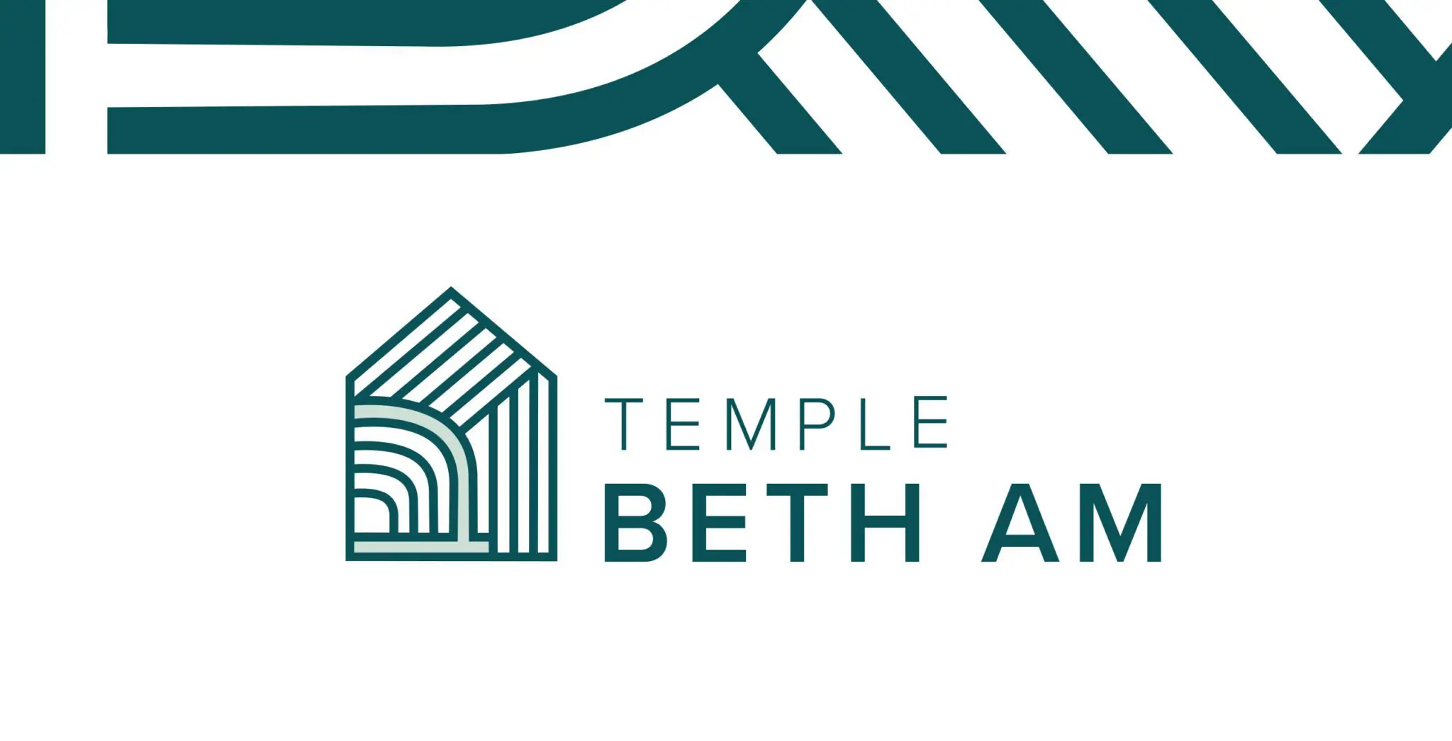
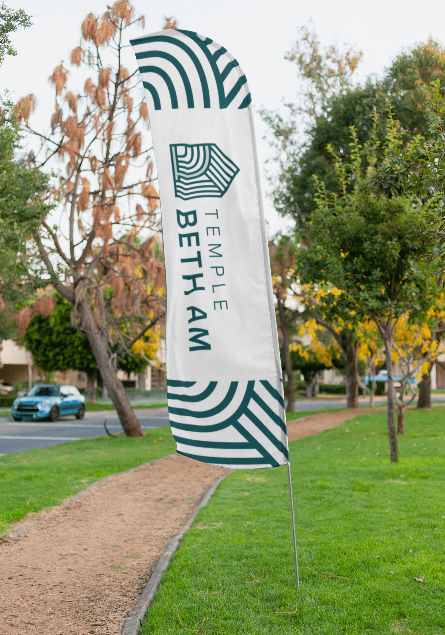
Temple Beth Am approached Talooka Studio to reimagine its outdated branding and reflect the congregation’s evolution under new leadership. Through collaborative discussions with the Rabbi and leadership team, we identified the core values of warmth, connection, and community, inspired by the concept of “Hygge” — creating a cozy, inviting atmosphere. The new logo features a pentagram shape symbolizing a haven, with flowing lines representing the congregation and their interwoven connections. The integrated Bet/Beit symbol, meaning “house of the people,” serves as a welcoming door, inviting members into the sacred space.
Temple Beth Am
Temple mockups
Temple mockups
The earthy, calming color palette reflects Temple Beth Am’s down-to-earth spirit and Seattle’s natural surroundings. This refreshed identity encapsulates their vision of being an inclusive gathering space while maintaining a balance between tradition and contemporary growth.
Temple mockups
Temple mockups
Temple mockups
" I really appreciated our conversation and the insights you both shared. Thank you so much for putting your hearts and smarts into your work. The final product shows what a thoughtful and complete approach you brought to our logo and style design."
Ruth A. Zlotnick